Understanding diagrams - GMAT Quantitative
Card 1 of 160

Public domain map from The World Factbook, Central Intelligence Agency.
Flight 783 departs from Oslo, Norway when it is 7:12 AM there; it lands in Dallas when it is 10:37 AM there. How long did the flight take?
(Assume Daylight Savings Time is not in effect.)
Public domain map from The World Factbook, Central Intelligence Agency.
Flight 783 departs from Oslo, Norway when it is 7:12 AM there; it lands in Dallas when it is 10:37 AM there. How long did the flight take?
(Assume Daylight Savings Time is not in effect.)
Tap to reveal answer
Refer to the time zone differences printed at the top of the map. The time zone for Dallas is marked  ; the time zone for all of Norway is marked
  . This means that Oslo is
  = 7") hours ahead of Dallas, so we need to adjust accordingly.
hours ahead of Dallas, so we need to adjust accordingly.
The flight took off when it was  in Oslo; if we subtract
  , then we find that it took off when it was
  in Dallas. Now subtract this from
  :
:

Adjust by adding  to
to  :
:

The flight took  .
.
Refer to the time zone differences printed at the top of the map. The time zone for Dallas is marked
The flight took off when it was
Adjust by adding
The flight took
← Didn't Know|Knew It →

Three candidates - Craig, Donna, and Elly - ran for student body president. By the rules, the candidate who wins more than half the ballots cast wins the election outright; if no candidate wins more than half, there must be a runoff between the two top vote-getters. You may assume that no other names were written in.
As can be seen in the figure above, which reflects the share of the vote each candidate won, there will be a runoff. Which two candidates will face each other?
Statement 1: Candidate C is Donna.
Statement 2: Craig won 528 votes.
Tap to reveal answer
From Statement 1 alone, it can be seen that Donna's share of the vote was the smallest of the three. Therefore, Craig and Elly were the top two votegetters, and they will face each other in the runoff.
Statement 2 alone provides insufficient information; without knowing the total number of voters, the share of the vote won by Craig (or any other candidate) cannot be determined from the number of votes Craig won.
← Didn't Know|Knew It →

Light blue: Goodman
Orange: Ferris
Gray: Inman
Yellow: Jones
Dark blue: Harris
Refer to the diagram. If 3,145 people voted in the school board election, (the results of which are represented in the diagram), then approximately how many people voted for Inman?
Light blue: Goodman
Orange: Ferris
Gray: Inman
Yellow: Jones
Dark blue: Harris
Refer to the diagram. If 3,145 people voted in the school board election, (the results of which are represented in the diagram), then approximately how many people voted for Inman?
Tap to reveal answer
According to the legend, the gray sector represents the portion of the electorate who voted for Inman. This sector is about one-fifth of the circle, so, to find the best estimate of Inman's share of the vote, take one-fifth of 3,145 - or, equivalently, divide 3,145 by 5:

630 is the best estimate of the choices given.
According to the legend, the gray sector represents the portion of the electorate who voted for Inman. This sector is about one-fifth of the circle, so, to find the best estimate of Inman's share of the vote, take one-fifth of 3,145 - or, equivalently, divide 3,145 by 5:
630 is the best estimate of the choices given.
← Didn't Know|Knew It →
In a room filled with 100 people, 52 are men and 40 are blonde. There were 16 blonde men in the room. How many non-blonde women were there? Use the following diagram.

In a room filled with 100 people, 52 are men and 40 are blonde. There were 16 blonde men in the room. How many non-blonde women were there? Use the following diagram.
Tap to reveal answer
Of the  people,
") were either men or blonde or both. Therefore,
were either men or blonde or both. Therefore,  are non-blonde and non-men (women).

Of the
← Didn't Know|Knew It →

The above table shows the results of a school election. According to the rules, the students who finish first, second, and third become President, Vice-President, and Secretary-Treasurer respectively. In the event of any tie, a runoff election will be held.
Who was elected Secretary-Treasurer?
The above table shows the results of a school election. According to the rules, the students who finish first, second, and third become President, Vice-President, and Secretary-Treasurer respectively. In the event of any tie, a runoff election will be held.
Who was elected Secretary-Treasurer?
Tap to reveal answer
Jones and Smith tied for third (87 each), so by the rules, there will be a runoff election for the office of Secretary-Treasurer between these two.
Jones and Smith tied for third (87 each), so by the rules, there will be a runoff election for the office of Secretary-Treasurer between these two.
← Didn't Know|Knew It →
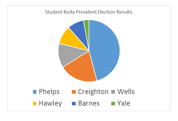
The above circle graph shows the results of a school election. According to the rules, the students who finish first, second, and third become President, Vice-President, and Secretary-Treasurer respectively. In the event of any tie, a runoff election will be held.
Who was elected Secretary-Treasurer?
Tap to reveal answer
The third-largest portion of the graph is the gray portion, which represents Wells. Wells won the office of Secretary-Treasurer outright.
The third-largest portion of the graph is the gray portion, which represents Wells. Wells won the office of Secretary-Treasurer outright.
← Didn't Know|Knew It →
The table below gives the population of the city of Renfrow for each of six census years.

Which decade saw a population decline?
The table below gives the population of the city of Renfrow for each of six census years.
Which decade saw a population decline?
Tap to reveal answer
The only census year in which Renfrow had fewer people than the previous one is 1970, so the correct choice is 1960-70.
The only census year in which Renfrow had fewer people than the previous one is 1970, so the correct choice is 1960-70.
← Didn't Know|Knew It →
The table below gives the population of the city of Renfrow for each of six census years.
Which decade saw the greatest increase in population?
The table below gives the population of the city of Renfrow for each of six census years.
Which decade saw the greatest increase in population?
Tap to reveal answer
For each decade, we can subtract the population at the beginning of the decade from that at the end. We omit 1960-70 since there was a population decline.


1950-60 saw the greatest increase.
For each decade, we can subtract the population at the beginning of the decade from that at the end. We omit 1960-70 since there was a population decline.
1950-60 saw the greatest increase.
← Didn't Know|Knew It →
The table below gives the population of the city of Renfrow for each of six census years.
The figures for subsequent years are not currently available but it is known that the increase over each decade since 1980 has been at least as great as the increase from 1970 to 1980. What was the minimum population in 2010?
Tap to reveal answer
The increase in population from 1970 to 1980 was  . Since each of the three ten-year growths from 1980 to 2010 was at least that much, the minimum population of Renfrow in 2010 was
The increase in population from 1970 to 1980 was
← Didn't Know|Knew It →

The above is the menu at Monorail Sandwich Shop.
Today, Monorail is running a special - buy three sandwiches and get a large soda free. A boss treats her employees to lunch; she orders three beef sandwiches, two turkey sandwiches, two ham sandwiches, and seven large sodas. There is no sales tax. If the boss hands the clerk a $100 bill, how much change will she get back?
Tap to reveal answer
The boss orders seven sandwiches, so two of the sodas will be free. Therefore, she will pay for three beef sandwiches, two turkey sandwiches, two ham sandwiches, and five large sodas. Their total price:


The change from a $100 bill is
 .
.
The boss orders seven sandwiches, so two of the sodas will be free. Therefore, she will pay for three beef sandwiches, two turkey sandwiches, two ham sandwiches, and five large sodas. Their total price:
The change from a $100 bill is
← Didn't Know|Knew It →
The above is the menu at Monorail Sandwich Shop.
Today, Monorail is running a special - buy any two sandwiches and get an additonal sandwich of equal or lesser value for free, with a limit of two free sandwiches per customer per day.
A father wants to buy some sandwiches for his family. He orders two beef sandwiches, three chicken sandwiches, and four veggie sandwiches. Disregarding sales tax, what is the least possible amount he will pay for them?
Tap to reveal answer
In descending order of cost, he is ordering sandwiches that cost the following:

Note that the father will get one chicken sandwich free with the two beef sandwiches, and that he will get one veggie sandwich free with the other two chicken sandwiches. Therefore, he will pay for the other seven sandwiches:

In descending order of cost, he is ordering sandwiches that cost the following:
Note that the father will get one chicken sandwich free with the two beef sandwiches, and that he will get one veggie sandwich free with the other two chicken sandwiches. Therefore, he will pay for the other seven sandwiches:
← Didn't Know|Knew It →
The above is the menu at Monorail Sandwich Shop.
Monorail is running a special today - for each sandwich you buy, you can purchase one large soda for ninety cents or get one small soda for free.
Kevin purchases three beef sandwiches, two large sodas, and two small sodas. Disregarding tax, how much will he pay?
Tap to reveal answer
Kevin will pay $5.89 each for the three beef sandwiches. He will pay $0.90 for each of the two large sodas and get one of the small sodas for free; he will pay the full price of $1.09 for one small soda. Therefore, Kevin will pay

Kevin will pay $5.89 each for the three beef sandwiches. He will pay $0.90 for each of the two large sodas and get one of the small sodas for free; he will pay the full price of $1.09 for one small soda. Therefore, Kevin will pay
← Didn't Know|Knew It →
The above is the menu at Monorail Sandwich Shop. The sales tax is 8%, and with the purchase of two sandwiches, a customer gets one free soda of any size.
Charlie wants to purchase four turkey sandwiches. He only has $30 on him and he has no checks, debit cards, or credit cards. How many large sodas can he get with the sandwiches and stay within his budget?
Tap to reveal answer
If  is the maximum price of the sandwiches before tax, then the price after tax is
  . Charlie can spend at most $30 after sales tax of 8% is counted, so we can set up the equation:


The four turkey sandwiches cost  , leaving

to buy drinks.
 buys one large soda.
 , so
, so  allows for the purchase of two. Also, with the four sandwiches, he gets two free sodas, so he can get a total of four sodas.
If
The four turkey sandwiches cost
to buy drinks.
← Didn't Know|Knew It →
Five candidates ran for the office of student body president at Garfield High School. According to the rules, the student who gets the most votes wins the office, with ties resulting in a runoff. However, Garfield has an unusual rule that states that seniors' votes count double.
This table shows how freshmen, sophomores, and juniors voted:

This table shows how seniors voted:

Who won the election?
Five candidates ran for the office of student body president at Garfield High School. According to the rules, the student who gets the most votes wins the office, with ties resulting in a runoff. However, Garfield has an unusual rule that states that seniors' votes count double.
This table shows how freshmen, sophomores, and juniors voted:
This table shows how seniors voted:
Who won the election?
Tap to reveal answer
For each candidate, add the number of freshman, sophomore, and junior votes to twice the number of senior votes:

Jones won the election.
For each candidate, add the number of freshman, sophomore, and junior votes to twice the number of senior votes:
Jones won the election.
← Didn't Know|Knew It →
Five candidates ran for the office of student body president at Buchanan High School. According to the rules, the student who gets a majority of the votes wins the office; if no student wins a majority, then there will be a runoff between the top two vote-getters. However, Buchanan has an unusual rule that states that seniors' votes count double.
This table shows how freshmen, sophomores, and juniors voted:

This table shows how seniors voted:

Who won the election?
Five candidates ran for the office of student body president at Buchanan High School. According to the rules, the student who gets a majority of the votes wins the office; if no student wins a majority, then there will be a runoff between the top two vote-getters. However, Buchanan has an unusual rule that states that seniors' votes count double.
This table shows how freshmen, sophomores, and juniors voted:
This table shows how seniors voted:
Who won the election?
Tap to reveal answer
For each candidate, add the number of freshman, sophomore, and junior votes to twice the number of senior votes:

Jones got the most votes. However, he clearly did not win a majority, so he and the second-highest vote-getter, Trask, will face each other in a runoff.
For each candidate, add the number of freshman, sophomore, and junior votes to twice the number of senior votes:
Jones got the most votes. However, he clearly did not win a majority, so he and the second-highest vote-getter, Trask, will face each other in a runoff.
← Didn't Know|Knew It →
The above table shows the initial count of the votes for a school election. According to the rules, the students who finish first, second, and third become President, Vice-President, and Secretary-Treasurer, respectively. In the event of any tie, a runoff election will be held.
After the initial count, it is discovered that some ballots were left out of the count by mistake. These votes were distributed as follows:

Who was elected Vice-President?
The above table shows the initial count of the votes for a school election. According to the rules, the students who finish first, second, and third become President, Vice-President, and Secretary-Treasurer, respectively. In the event of any tie, a runoff election will be held.
After the initial count, it is discovered that some ballots were left out of the count by mistake. These votes were distributed as follows:
Who was elected Vice-President?
Tap to reveal answer
The revised vote count is as follows:

Trask finished second with 116, so he was elected Vice-President.
The revised vote count is as follows:
Trask finished second with 116, so he was elected Vice-President.
← Didn't Know|Knew It →

Public domain map from The World Factbook, Central Intelligence Agency.
Flight 984 departed from London (green circle) when it was 6:12 PM there. It arrived in Chicago, IL (red circle) 8 hours, 30 minutes later. What time was it in Chicago upon the flight's arrival there?
(You may assume that Daylight Savings Time is not in effect.)
Tap to reveal answer
Refer to the time zone differences printed at the top of the map. The time zone for Chicago is marked  ; the time zone for London is marked 0. This means that London is
  = 6") hours ahead of Chicago, so we need to adjust accordingly.
hours ahead of Chicago, so we need to adjust accordingly.
The flight departed from London when it was 6:12 PM in London, so we subtract six hours from this to get 12:12 PM, the time it was in Chicago. Now we can add 8 hours, 30 minutes, first rewriting 12:12 PM as 0:12:

The flight landed in Chicago when it was 9:42 PM there.
Refer to the time zone differences printed at the top of the map. The time zone for Chicago is marked
The flight departed from London when it was 6:12 PM in London, so we subtract six hours from this to get 12:12 PM, the time it was in Chicago. Now we can add 8 hours, 30 minutes, first rewriting 12:12 PM as 0:12:
The flight landed in Chicago when it was 9:42 PM there.
← Didn't Know|Knew It →

Public domain map from The World Factbook, Central Intelligence Agency.
Flight 122 departed from Washington, DC (green circle) when it was  there. It arrived in Paris, France (red circle)
  later. What time was it in Paris upon the flight's arrival there?
(You may assume that Daylight Savings Time is not in effect.)
Public domain map from The World Factbook, Central Intelligence Agency.
Flight 122 departed from Washington, DC (green circle) when it was
(You may assume that Daylight Savings Time is not in effect.)
Tap to reveal answer
Refer to the time zone differences printed at the top of the map. The time zone for Washington, DC is marked  ; the time zone for Paris, France is marked . This means that Paris is
  = 6") hours ahead of Washington, so we need to adjust accordingly.
hours ahead of Washington, so we need to adjust accordingly.
The flight departed from Washington when it was  in Washington, so we add
  to this to get
  , the time it was in Paris. Now we can add
  :
:

Now adjust again by subtracting  ; this means it was
  in Paris when the flight arrived.
Refer to the time zone differences printed at the top of the map. The time zone for Washington, DC is marked
The flight departed from Washington when it was
Now adjust again by subtracting
← Didn't Know|Knew It →
Three candidates - Xenia, Yancey, and Zane - ran for student body president. By the rules, the candidate who wins more than half the ballots cast wins the election outright; if no candidate wins more than half, there must be a runoff between the two top vote-getters. You may assume that no other names were written in.
As can be seen in the figure above, which reflects the share of the vote each candidate won, there will be a runoff. Which two candidates will face each other?
Statement 1: Yancey is not Candidate A.
Statement 2: Xenia is not Candidate C.
Tap to reveal answer
From the diagram, it can be seen that Candidates A and B will compete in the runoff.
Assume both statements to be true. Since Xenia is not Candidate C, she will participate in the runoff. However, we do not know whether she is Candidate A or B. If she is Candidate B, then Yancey, who is not Candidate A, must be Candidate C, and Xenia will face Zane in the runoff. However, if Xenia is Candidate A, Yancey or Zane can be Candidate B. Therefore, while it can be determined that Xenia is in the runoff, her opponent cannot be determined with certainty.
← Didn't Know|Knew It →
Public domain map from The World Factbook, Central Intelligence Agency.
Flight 783 departs from Oslo, Norway when it is 7:12 AM there; it lands in Dallas when it is 10:37 AM there. How long did the flight take?
(Assume Daylight Savings Time is not in effect.)
Public domain map from The World Factbook, Central Intelligence Agency.
Flight 783 departs from Oslo, Norway when it is 7:12 AM there; it lands in Dallas when it is 10:37 AM there. How long did the flight take?
(Assume Daylight Savings Time is not in effect.)
Tap to reveal answer
Refer to the time zone differences printed at the top of the map. The time zone for Dallas is marked ; the time zone for all of Norway is marked . This means that Oslo is hours ahead of Dallas, so we need to adjust accordingly.
The flight took off when it was in Oslo; if we subtract , then we find that it took off when it was in Dallas. Now subtract this from :
Adjust by adding to :
The flight took .
Refer to the time zone differences printed at the top of the map. The time zone for Dallas is marked
The flight took off when it was
Adjust by adding
The flight took
← Didn't Know|Knew It →